Fairly One-Dimensional

Mining my google search history for clues, Part I

2015-06-28

We all have intensely personal relationships with Google. The questions we ask of it can, in many ways, tell the story of our lives. Ranging from questions about our work to our hobbies to our fears, many people are honest with Google in a way they are with a select few. I recently found out that Google allows users to download a record of the search queries in easily digestible JSON, and I immediately knew that this would be the topic of my next blog post. Pretending that I know nothing about myself, what can I learn about my life by looking through my search history? In part one of this two-part post, I'll explore the general themes present in my queries. What words appear the most often in my searches? How have my searches changed over the past two years? How about over the course of a week? Let's find out.

Data

I was able to download a little less than two years worth of my search queries by following the guide here. Google provides individual JSON files for each financial quarter containing the timestamp and content of each query. Map queries are included as well. Unfortunately, they are not clearly labeled, so I was unable to exclude them. Direction queries, however, all contained '->', so I removed all queries containing that arrow.

The first query in my database was performed on July 28, 2013, and these data were collected on June 22, 2015. I'm not sure why Google only has two years worth of data available on me. Presumably, I deleted my entire history in July, 2013, though I don't remember doing so. While all the other datasets used on this blog have been publicly available or been made available by me, I am going to keep this dataset to myself for privacy reasons. In total, this dataset comprises 22,339 search queries.

Results

What words appear the most often in my searches?

For this exercise, I'm going to take a naive approach to the data. In other words, I'm going to pretend that I know nothing about myself. To start with, what words appear in my queries most often? As a pre-processing step for this question (and the questions below), I tokenized each query into individual words, removing punctuation. I also converted all words into lowercase to remove case conflicts. To calculate the frequency of each word, I simply used the Natural Language Toolkit (NLTK) object, FreqDist. For this analysis, I also removed common, uninformative, words, such as conjunctions and articles. Let's take a look at the fifty words that appear most often in my search queries.

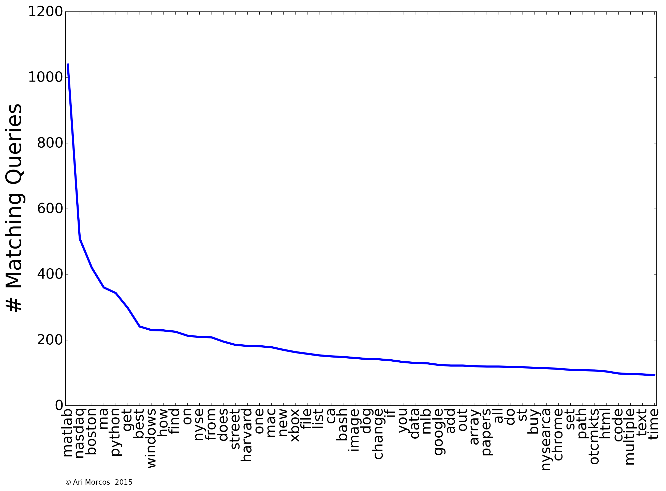
A few themes immediately jump out. First and foremost, my most searched for word, by a large margin, is "matlab." As a neuroscientist working in academia, I spend the majority of my day coding in Matlab, so this makes sense. You can also see several other programming related words pop up with high frequency, including "python," "bash," "array," "html," and "list." We also see another theme: finance. Financial words abound, including "nasdaq," "nysearca," and "nyse." There are also words relating to video games (e.g., "xbox"), operating systems (e.g., "windows"), and baseball (e.g., "mlb").

It is also obvious that I live in Boston and attend Harvard, as "boston" and "ma" are two of the four most frequently used words, and "harvard" comes in at #16.

How have my searches changed over time?

From looking at the frequency distribution, I was able to tease out several obvious themes in my searches. Are searches for these themes constant throughout time, or has their frequency changed over the past two years? To find out, I binned the data into individual months, and counted the number of queries in each bucket containing words related to the theme of interest. As an example, for the "Web Development" theme, I included "html" and "css" as relevant search terms. Note that each query can only be counted once, so a query containing both of these words would not be double-counted. Below, I've plotted the number of matching queries over time for several of the above categories.

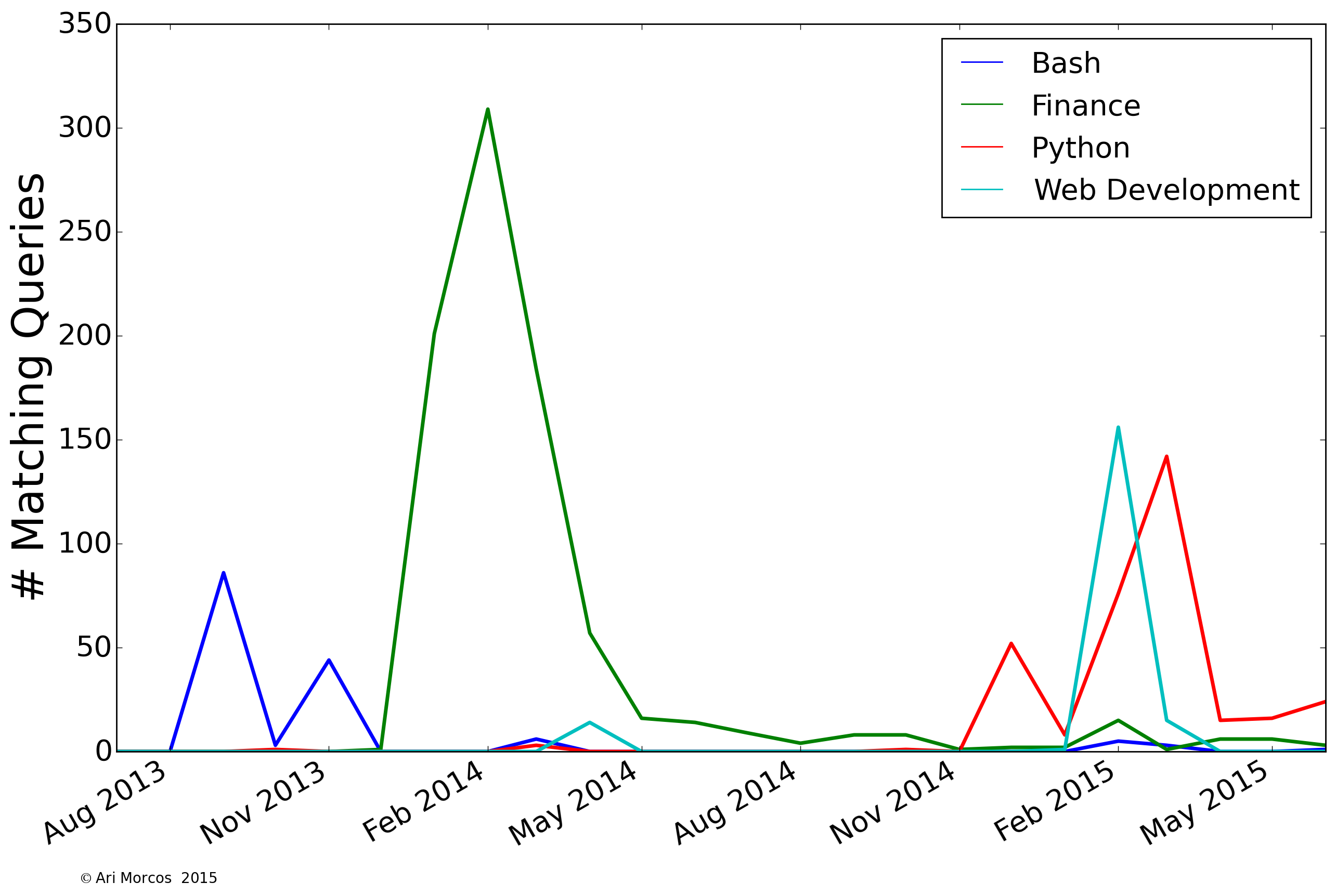
We can immediately see that all of these terms were searched for over short time periods, and not so much outside of that narrow window. I searched for "bash" a lot in late 2013 while I was learning how to use Orchestra, Harvard Medical School's high performance computing cluster for my research. Shortly thereafter, I developed an intense interest in finance and investing, which lasted through the early summer of 2014. I built this website in early February of this year, and therefore spent a lot of time searching for terms related to web development. Finally, I started learning python at the end of last year, and my searches related to that have continued, with a big peak when I undertook my first big project with python on clustering subreddits based on common word usage in March.

We can perform this same analysis for several other themes as well:

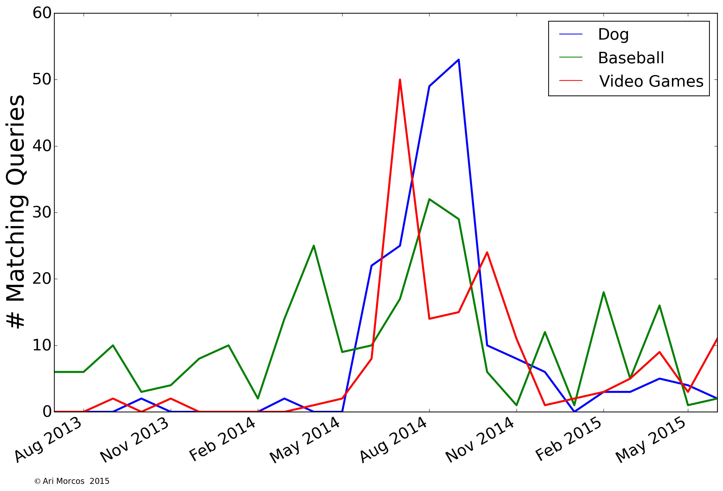
We can see that I searched a lot for "dog" in late summer, 2014, just before I rescued by dog, Dash, who's prominently featured in my about me page. We can also see two search themes with interesting cyclical patterns. First, my searches for baseball ebb and flow with the season, falling off after the World Series in October, picking up again during the Winter Meetings in December, and then finally coming back to life in anticipation of the season starting in April. You can also see that the long season takes a toll on me, as my interest wanes some in early summer before picking back up during the pennant races. My searches related to video games are also cyclical, peaking around E3 in June and the major releases in the fall.

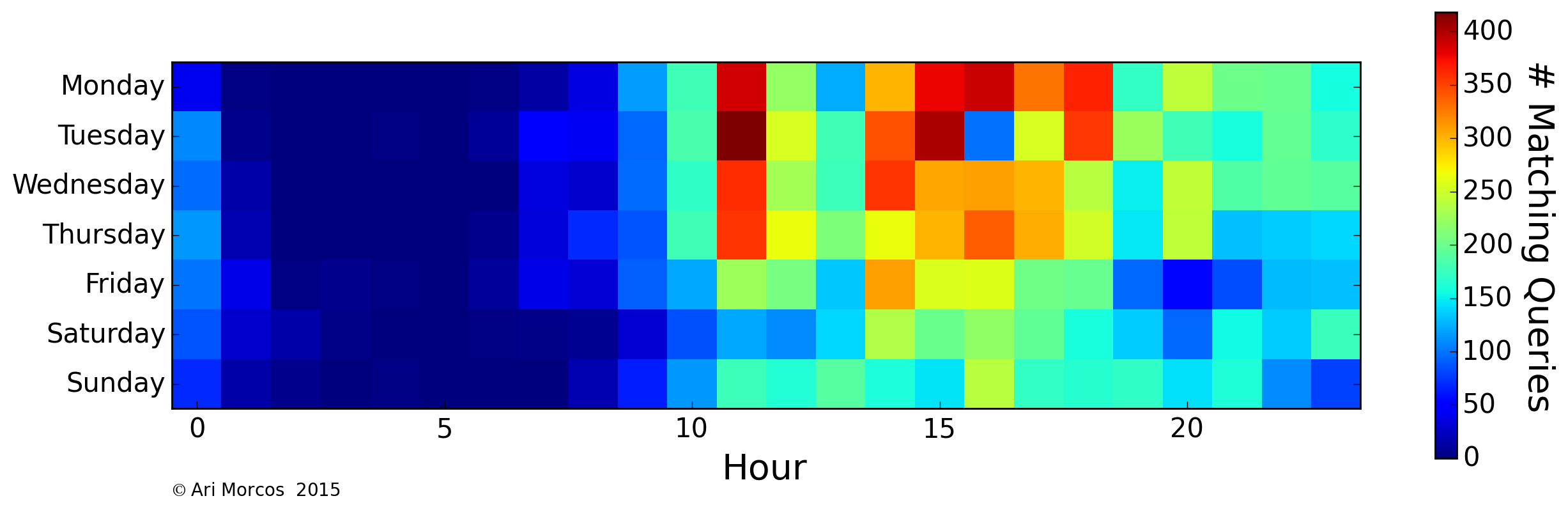
How do my searches change over the course of a week?

Next, let's look at when in the week I most often search. We can visualize this as heat map, in which each row represents a day of the week, and each column represents an hour of the day. The color of each pixel corresponds to the number of matching queries. First, we can look at all of my searches to get a general idea of when I search the most:

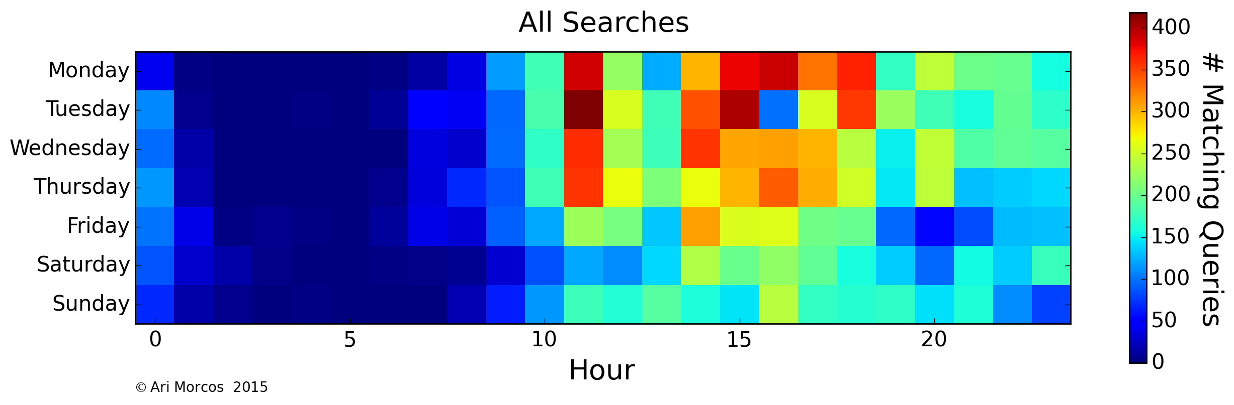
As might be expected, we can see that I search most often during the work day and quite often in the evening, but very infrequently between the hours of 1AM and 8AM, when I'm usually asleep. On average, I search more frequently during the week, but not by a tremendous margin. There is also a single pocket on Tuesdays at 4PM. This lack of searches corresponds to my lab's weekly meeting. Now that we have an idea of what my general search patterns look like, let's look at specific themes. For example: the word, "matlab":

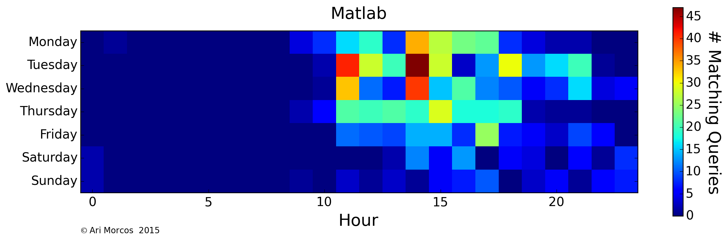
Because I use Matlab primarily for my research, I search for it most often during the day on weekdays. Apparently, I'm also substantially less productive on Fridays. Whoops. On the flip side, I use python primarily for this blog, and my side projects:

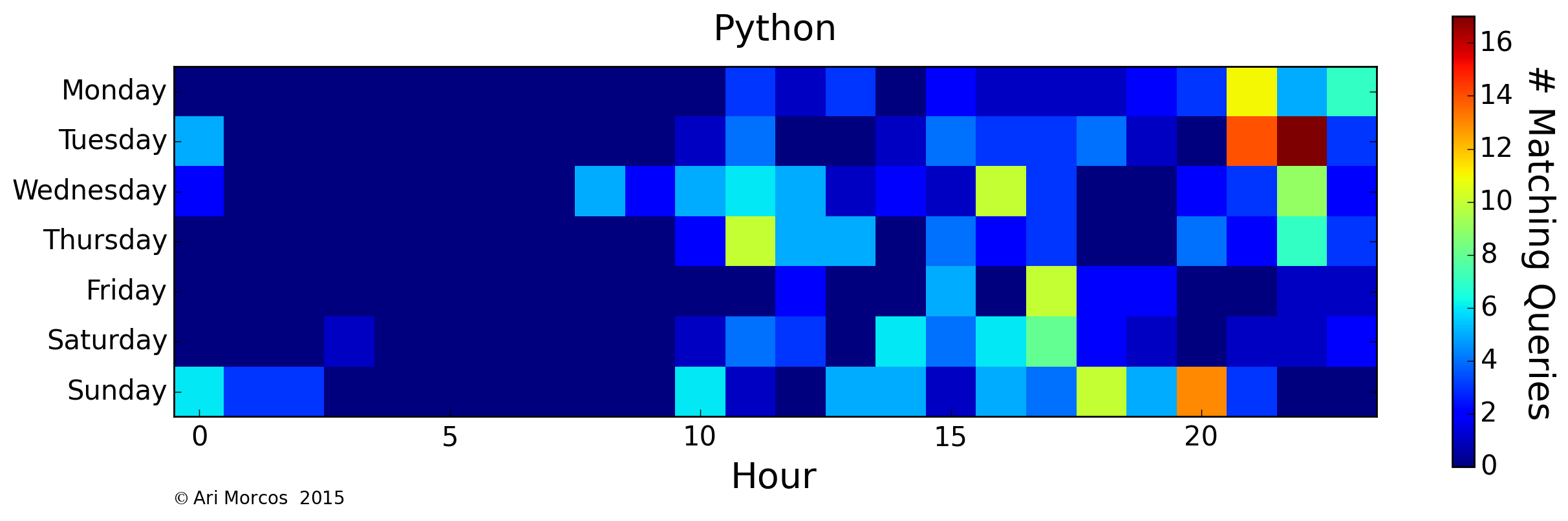
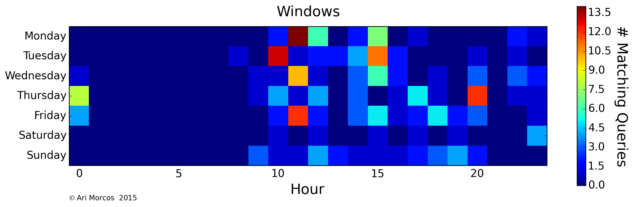
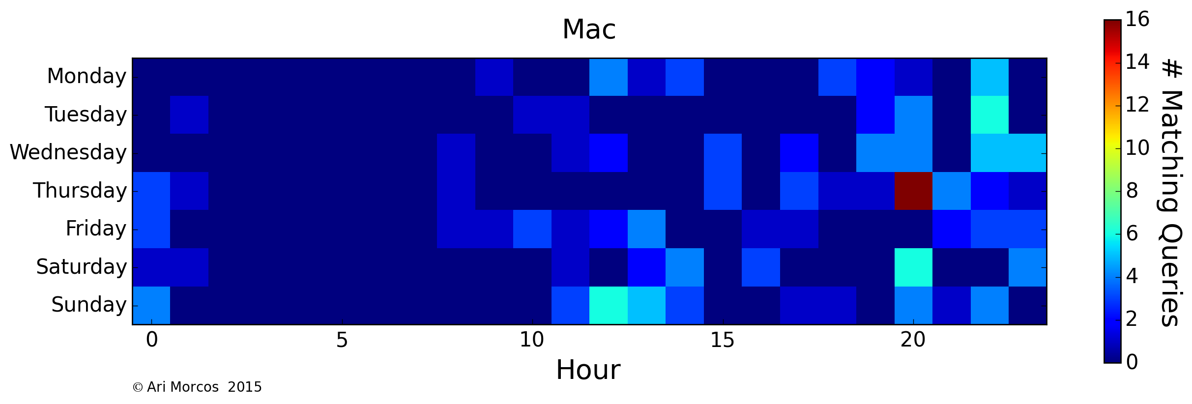
Here, we see an approximately inverted graph, with most of my searches relating to python occurring in the evenings during the week and during the day on weekends. A similar trend exists for operating systems, as I use a Windows 7 PC at lab, and a Mac at home.

Finally, let me leave you with my favorite plot from this analysis. When do I search for terms relating to video games?

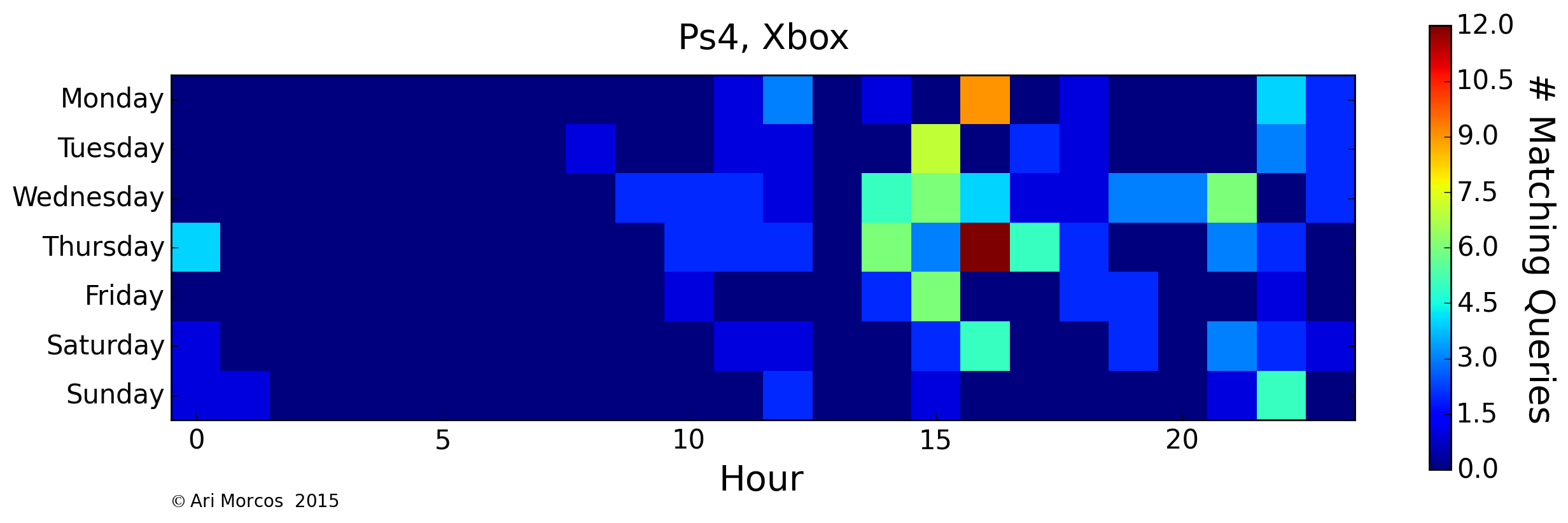
Apparently, late afternoons during the week are tough for me, as I seem to usually take a break and search for video games, seemingly looking ahead to playing something when I get home.

Closing thoughts

While perhaps not surprising, it's a little scary how much I could learn about my habits through even a cursory analysis of my search history. Moreover, I tend to be careful about my searches. If I don't want it to be recorded, I use incognito mode in chrome or a privacy-first search engine such as DuckDuckGo. If I didn't have these habits, I might have had to filter a lot more of the results for this post.

Furthermore, these analyses don't even get into the really interesting stuff one can do with search data given the histories of large quantities of users. Applying machine learning tools to these data to make inferences about users must have incredible power, and perhaps justifies the growing tide of Google-phobia. That said, these data also have tremendous power to make our lives easier. I appreciate that my searches are more likely to return what I'm looking for because Google "knows" me. Ultimately, it's up to each of us individually to decide how much we're willing to give away in exchange for convenience.

You may have noticed that this post is titled Part I. That's because I have several more ideas for analyses on this dataset. How often do I search for the same thing more than once and how much time passes in between? How do my queries evolve when I'm having trouble finding what I want? Expect a Part II with these analyses shortly!


You can check out the iPython notebook used to perform these analyses here.

Sentiment analysis of movie taglines

2015-06-17

I recently came across Randal Olson's excellent post on how the usage of sex, drugs, violence, and cursing in movies have changed over time. This article led me to start thinking: how else have movies changed over time? Has the content of movie taglines (such as "The park is open." for Jurassic World or "Some men dream the future. He built it." for The Aviator) changed over time? In particular, have movie taglines gotten more negative?

Getting a "sentiment score"

Tools and Data

The data for this analysis is freely available via IMDb's interfaces. I extracted all of the taglines along with each film's genre (using the taglines.list and genres.list files) into a pandas data frame. I used the excellent Natural Language Toolkit (NLTK) as a scaffolding for all of these analyses. To limit the analysis to only those movies with taglines in English, I used langdetect. Finally, I used the SentiWordNet 3.0 (SWN) database to get the actual scores for each word. The final analysis was performed on 7,381 taglines.

The problem of multiple meanings

One of the challenges of extracting sentiment I had underestimated before attempting this analysis is that words can have dramatically different connotations depending on their context. For example, "killing" might generally have a strong negative valence, but in the context of "killing it," might be positive. Moreover, each word is represented in the SWN database separately for each of its unique contextual meanings.

While I made rudimentary attempts to deal with this problem, I mostly ignored it because the absolute sentiment score of a given tagline is irrelevant in these analyses. All that matters here is the relative sentiment scores across years/genres, so, hopefully, noise due to multiple meanings should average out. That said, the multiple meanings problem is absolutely a confound in these analyses.

Putting it together

The first step in my sentiment analysis pipeline was to tokenize each tagline into individual words and punctuation marks. I tagged each token with its part of speech, and excluded punctuation marks, articles, etc., keeping only nouns, verbs, adjectives, and adverbs. Each remaining word in a tagline was then compared to the SWN database to extract each word's net sentiment score. Because each word returns multiple results in the database (due to different parts of speech and different definitions), I filtered the matches to only include database entries with the same part of speech as my requested word, and took the difference between the average positive score and the average negative score as each word's net sentiment score. To get a final sentiment score for a tagline, I simply summed each component word's net sentiment score.

Because sentiment scores are represented as the difference between positive and negative, a value of 0 indicates a neutral connotation, and positive/negative values represent positive/negative valence.

Results

So, what happened? Have taglines gotten more negative over the last 50 years?

Unfortunately, it seems the answer is no. In fact, it seems they've remained mostly unchanged. The extreme variation between 1950 and 1975 is mostly due to a smaller sample of movies with taglines in the IMDb database for those years. My first thought upon seeing this result was that the multiple meanings problem completely obscured any effect that might be present. As a control for this, I asked how the mean (+/- SEM) sentiment score differs across different film genres.

In general, I think this looks pretty reasonable. Horror, action, thriller, and crime movies are all negative, while family movies are the most positive, and the few genres that seem out of place, like musicals, had few samples. This seems to suggest that the general analysis pipeline works to pull apart the differences between taglines, leading me to believe that the null result above is, in fact, genuine.

On average, movie taglines are neutral or ever so slightly positive and have been that way for the last half-century.

The challenges of sentiment analysis

When I first decided to take on this analysis, I assumed that the sentiment analysis component would be relatively straightforward. While it seems that the results of this analysis are in the right ballpark, the manner in which I dealt with the multiple meanings problem here would be drastically insufficient for say, mining sentiment on Twitter to predict future stock price movements. One way I could have better handled the multiple meanings problem would have been to use n-grams (i.e. groupings of words. A bigram is a pair of words, a trigram a word triplet, etc.). These might have allowed me to better extract the precise meaning of a given word in a tagline given its context. Another, substantially more complex approach, is to use Recurrent Neural Networks (RNNs) to approach sentiment analysis. RNNs are actively being used for sentiment analysis, often with extremely good results. If I were to continue this analysis, I think this is the approach I would take.

Publication bias

Once I had convinced myself that this analysis produced a negative result, I struggled immensely with whether or not to write about it. The bias against negative results is ubiquitous throughout academia, perhaps especially in the life sciences, and as a product of academia, it's been ingrained in me. I think most would agree, however, that this bias is harmful to the entire scientific endeavor.

On this blog, I intend to publish all my results, whether or not they agree with the most interesting interpretation of the data.


You can check out the iPython notebook used to perform these analyses here.

Clustering subreddits by common word usage

2015-03-26

One of reddit's best features, along with its voting system, is the ability for users to create their own subreddits, forums dedicated to specific topics. There are subreddits for any and every topic one can think of, and redditors know that subreddits quickly take on dynamic personalities. Some subreddits are known for vigorous discussion, while others simply represent a constantly updated collection of entertaining content. Some serve as learning resources for those new to a field, while others are places for debates among experts. Some are incredibly supportive, while others quickly become havens for trolls.

But what defines a subreddit? There are some obvious answers: topic, content type (images, videos, self-posts, or all of the above), and user population. For example, by topic, one might expect subreddits related to video games to be more similar to one another than any of them are to /r/politics. By content type, it seems reasonable to assume that self-post only subreddits like /r/AskHistorians and /r/AskScience are more similar to one another than either is to /r/AdviceAnimals. But are there more subtle differences between subreddits that can be used to group them in meaningful ways as well? Do users of the different subreddits write in distinct, predictable fashion? How much information does it take to categorize a subreddit? As it turns out, not nearly as much as one might think.

Creating subreddit-specific word frequency distributions

To answer the question of whether users in different subreddits write in distinguishable ways, I analyzed the frequency of words used in the comments of each subreddit. Choosing the right number of words to analyze is a bit of a balance. Choose too few words (the, a(n), etc.), and the subreddits will be entirely indistinguishable. Choose too many, and you'll quickly start getting subreddit specific words, such as names, which will trivialize the problem (e.g. "Clinton" is much more likely to appear in a politics related subreddits, while "Bioshock" is much more likely to appear in video game subreddits). For these analyses, I chose to use the 100 words most frequently used across the comments of the top 50 subreddits. This list includes common articles, a lot of pronouns, and a lot of basic verbs. However, there are no words which should be definitively linked to a given subreddit. For example, the 98the, 99th, and 100th words are "going," "want," and "didn't," respectively. You can see a complete list of the words here. Thus, the distribution of these words should provide an intuition into how users write while remaining agnostic to the "jargon" of each subreddit.

With these words in hand, I analyzed the comments submitted to the 50 most popular subreddits between March 2 and March 8, 2015. If you're interested in how I acquired this dataset, check out this post. To create word frequency distributions for each subreddit, I simply counted the number of occurrences (case-insensitive) of each of the 100 words, and normalized by the total number of words in each subreddit. This normalization step is key, because if one simply uses the absolute counts, subreddits with longer comments (such as /r/AskReddit) will clearly separate from all the other subreddits).

A subreddit distance matrix

As a first pass analysis on these data, I calculated the euclidean distance between the 100-dimensional normalized word distributions for each pair of subreddits, resulting in the following matrix:

Each point in the matrix represents the comparison between two subreddits. Cooler colors signify more similar subreddits, hotter colors subreddits that are more different. Elements along the diagonal represent a comparison of a subreddit to itself, so the distance is 0. Also note that there's no directionality to these comparisons so the matrix is symmetric.

A few observations pop out immediately. First, there are a few bastions of blue off the diagonal. In a lot of ways, these make intuitive sense. /r/funny, /r/pics, /r/gifs, /r/WTF, and /r/videos are all pretty similar to one another. All of these subreddits link to content as opposed to self-posts, they all are or once were default subreddits, and none of them are known for "serious" conversation.

Second, /r/circlejerk is different from every other subreddit. Third, the sports subreddits (/r/nba, /r/nfl, /r/SquaredCircle, and /r/soccer) are all pretty similar as are the variety of video game subreddits.

There are many more observations to be made from this matrix, but it's a little challenging to quickly grasp the clusters using this technique. Let's try a different method which might make this easier.

Clustering subreddits

Instead of plotting a distance matrix, it would be substantially more intuitive to plot the subreddits such that there location described their similarity. Unfortunately, we've yet to find a great way to visualize a 100-dimensional space, so I used principal components analysis (PCA), one of the most basic forms of dimensionality reduction, to allow us to better visualize the data. Briefly, PCA is a method which allows us to reveal the underlying structure in the data. While the data may occupy 100 dimensions, if dimensions are strongly correlated, we might only need a few dimensions to describe the majority of the variability. PCA attempts to do this by remapping or "projecting" the data onto these dimensions. As it turns out, in these data, there's quite a bit of structure, as the first three principal components explain more than 50% of the total variance, and the first 15 explain more than 90%.

I then used affinity propagation, a clustering algorithm based on message passing, to cluster the data in the first 3 principal components. One really nice feature of affinity propagation is that, as opposed to k-means clustering, it doesn't require you to estimate the number of clusters beforehand. The algorithm clustered the data into 7 nicely separated clusters, as displayed in images below.

From this image, we can see that, not only does the data cluster cleanly, the clusters make sense. The orange cluster contains all the sports subreddits, the navy blue cluster contains the content subreddits discussed above, the royal blue cluster contains the video game subreddits, the green cluster contains an odd assortment of subreddits with no clear pattern, and the teal cluster contains the more intellectual subreddits.

Interestingly, the most similar pair of subreddits, /r/gentlemanboners and /r/Celebs, define a cluster all on their own, as does /r/circlejerk.

What defines the subreddit clusters?

So we can cluster the subreddits cleanly, but what defines these clusters? As a general overview, we can look at the contribution of each word to each of the principal components.

The above plot shows the sum of the absolute values of the contributions to each of the first three principal components. If we look at the words which have the largest contribution, they tend to be pronouns and possessive pronouns (my, I, you, she, her, etc.), along with a few other miscellaneous words like "looks."

But what about individual clusters? To analyze the words that define individual subreddits, I calculated the mean frequency for each word across all the subreddits and then divided each subreddit's distribution by the mean distribution. A value of 1 indicates that the word has the same frequency as the mean frequency for that word. Values above/below 1 indicate that the word is over/underrepresented. So, what does this look like for the gentlemanboners/Celebs cluster?

Comically, the cluster is defined by a nine-fold overrepresentation of "she," an eight-fold overrepresentation of "her," and a five-fold overrepresentation of "looks," along with an underrepresentation of "he," "his," and "people." The sports subreddits, on the other hand, are defined by pretty much the opposite phenomenon. Take /r/nfl for example:

Sports subreddits: overrepresentation of male pronouns, along with an underrepresentation of female pronouns along with "looks." What about the subreddits in the green cluster such as /r/trollXChromosomes?

Again, the subreddits in this cluster are defined by pronouns, but this time by pronouns associated with oneself such as "I," "my," "me," and "I'm."

The other clusters are defined by more subtle patterns, and are less dominated by individual words. However, I want to point out one more which I find personally gratifying. What defines /r/science?

Again, some pronouns, but perhaps reflecting the collective spirit of science, the singular pronouns are all underrepresented while the only overrepresented pronoun is "we."

Conclusions

Overall, I'm quite pleased with how this analysis turned out. Not only did subreddits cluster in a reasonable fashion according to topics, many of the clusters can be defined by differences in just a few individual words, with pronouns having a disproportionate influence. Perhaps most surprisingly, one can categorize subreddits based on just a small subset of words and comparatively little processing. I suppose how we write says a lot about us.

You can check out the iPython notebook used to perform these analyses here.

Creating a reddit data set

2015-03-13

In preparation for the first set of analyses I'm planning for this blog, I spent some time over the last week preparing a package to create data sets from reddit. The package will collect comments and posts from specified subreddits within a custom date range and save it to a sqlite3 database for later analysis.

To do this, I've used PRAW, a python wrapper for the Reddit API. PRAW allows you to easily retrieve comments and posts from specific subreddits and users and gracefully handles Reddit's API usage limits. However, finding posts within a specific time range is much trickier.

PRAW/Reddit API Basics

This isn't intended as a tutorial for PRAW. If you want that, I recommend visiting their docs. This section will only go through the fundamentals of PRAW necessary to create a data set from reddit.

First, let's import praw and the redditDataset module

import praw
import redditDataset

Next, let's initialize a connection with PRAW as follows:

redditObject = praw.Reddit(user_agent='get_reddit_dataset')

We can grab subreddits using getSubreddits. Here, we'll grab /r/funny and /r/gaming

subreddits = redditDataset.getSubreddits(redditObject, ['funny', 'gaming'])

PRAW also has a variety of functions to grab subreddits. One of the most useful is the method get_popular_subreddits.

popularSubreddits = redditObject.get_popular_subreddits(limit=200)

This will return a generator containing the 200 most popular subreddits. PRAW has many other methods to grab specific submissions, comments, users, etc., but these are the only ones you'll need to know to use the module.

Now that we have a reddit object and the subreddits to query, let's make a data set.

Grabbing a data set from a set of subreddits

Once you have a generator or list of subreddit objects and your praw object, call createDataset to start downloading comments and posts into a sqlite3 database. The database will be saved in ~\Databases\<dbName>db.

Let's grab all the posts from the funny subreddit from March 1, 2015:

funnySubreddit = redditDataset.getSubreddits(redditObject, ['funny'])
redditDataset.createDataset(redditObject, funnySubreddit, startDate='150301000000'
                            endDate='150301235959', dbName='March_01_2015_funny_posts'
                            fineScale=4)

Basically, you give createDataset the reddit object, the subreddits (in list or generator form), a start and end date, a base name for the database, and a fine scale (which I'll get to in a moment).

For the start and end date, provide a string in the format 'yymmddHHMMSS'. So, in the above example, we're pulling posts between March 1, 2015 at 12:00:00 AM and March 1, 2015 at 11:59:59 PM.

Unfortunately, the reddit API will only provide a list of 1000 posts for any query. What does this mean for us? Well, say we want to get all the posts from 2014. If we request all those posts, we'll only get the 1000 with whatever sort is specified (createDataset uses a 'top' sort). To get around this, createDataset will make many requests in increments of 'fineScale' hours. So, in the example, above, we'll actually make six separate queries for a theoretical maximum of 6,000 posts. Because of the overhead associated with getting posts, we want to set this parameter to be as large as possible while still getting all the data we want. I've found that 8 works well for all but the most frequented subreddits.

And that's it! It'll work to retrieve all the posts within the desired range and the top comments from each post (by default, this is set to 100). One thing to note: because of the reddit API limits, this process is slow. We can only make 30 requests per minute. Currently, we only get the data for one post per request. I think this can be improved (potentially up to 25 posts per request), but I haven't gotten around to it yet.

Database structure

The sql database is pretty simple. It has two tables: submissions and comments.

Each row in submissions represents a single post. The columns contain the postID, postTitle, postBody (text if a self-post, url if a link), postScore (as of when it was downloaded), subredditName, and subredditID.

Each row in comments represents a single comment in a post. The columns contain the commentDate, user, body, comScore (as of when it was downloaded), and the postID.

How to grab posts within a specified time range

If you're just interested in using the package, you can skip this part. Figuring out how to grab posts within a time range was a bit of a pain as there's no native support for it in the reddit API or in PRAW. Reddit offers native support for filtering based on a set date range relative to now. So, for example, it's easy to grab posts from the last hour, day, week, month, or year, but challenging to grab posts from the month before last, or even the last month except for today. I spent a long time searching for an alternative with little success.

I eventually figured out that the reddit search engine accepts timestamp queries with the date provided in the unix time format. So, the search query timestamp:1425186000..1425229199 will return the 1000 posts sorted however you'd like (new, top, hot, relevance) from March 1, 2015. Importantly, this will not work using the default reddit search engine. You need to add syntax=cloudsearch to the end of the url to enable the native features of Amazon CloudSearch, one of which is timestamps.

Summary

You can check out the code for this project here. I've also collected a data set of almost all the posts along with their top 100 comments from the top 200 subreddits from March 2-8, 2015. You can get this database here.

Now that I have the data, it's time to start asking questions!

Hello World!

2015-02-24

Hello internet! Welcome to Fairly One-Dimensional, my blog about finding patterns in complex datasets. My goal is to post a new analysis of some freely available dataset every week or two (assuming my research allows me the time). These posts will usually be motivated by questions about the data itself, but I'll probably also post analyses intentionally constructed to make use of various techniques in machine learning I want to try out. As I'm a huge baseball fan, I imagine a fair number of posts will focus on sabermetrics as well. In making this blog, I was inspired by a bunch of people doing awesome analyses, especially FiveThirtyEight, Randal Olson, Baseball Prospectus, and Fangraphs.

As for the website itself, it's built with a Flask back end and Twitter Bootstrap 3 for the front end. I had never built a website before, and it's been a lot of fun learning about the amazing resources people have come up with. The source is available on Github.